
The KDP Learning Curve: What No One Tells You
Format-Specific Challenges That Will Test Your Sanity
June 4, 2025 | 12-minute read
In my previous post, I shared the emotional rollercoaster of my first experience with Amazon’s Kindle Direct Publishing. Today, I’m diving into the technical nitty-gritty — the format-specific challenges and platform quirks that KDP’s marketing conveniently omits.
This isn’t about complaining. It’s about preparation. When you know what’s coming, you can plan accordingly and avoid the hair-pulling frustration I experienced.
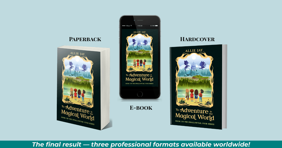
Each format — eBook, paperback, and hardcover — presents its own unique set of challenges. Let’s examine them one by one, with practical solutions that might save your publishing timeline (and possibly your mental health).
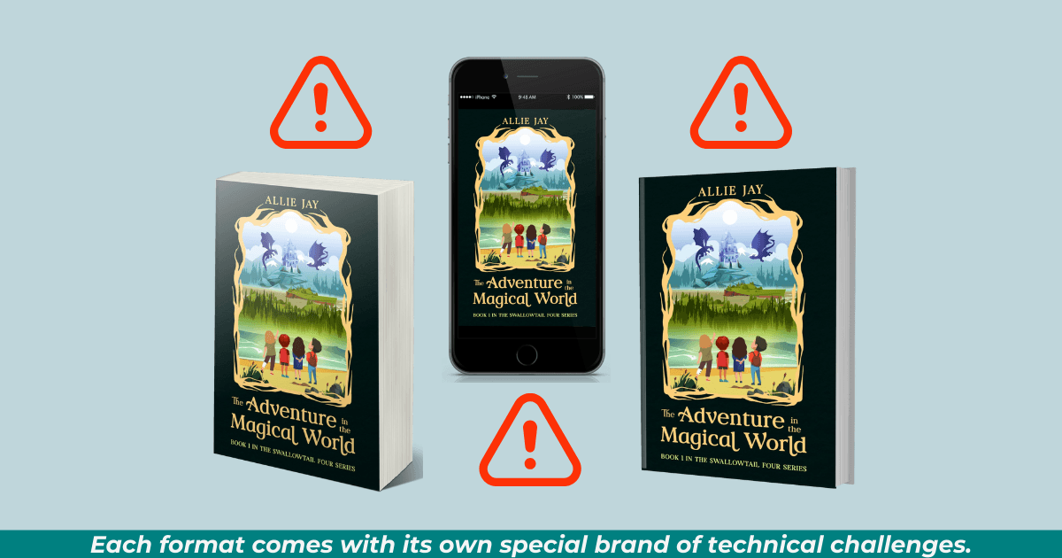
E-Book Enigmas: The Digital Format Mysteries
Publishing an eBook should be the simplest format, right? After all, there’s no physical product to manage. Just a digital file that gets delivered to devices.
If only it were that simple.
Cover Conundrums
My most persistent eBook issue was the missing cover on the Amazon sales page. Despite the cover showing correctly in my KDP dashboard and being uploaded according to specifications, it simply wouldn’t appear on the live site.
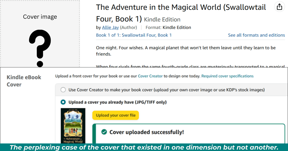
What I learned:
KDP’s systems for internal verification and public display are disconnected
Technical issues often require multiple support tickets
Amazon’s “tech team” operates on their own timeline, regardless of promises made by support staff
Solution that worked: Persistent follow-up and re-uploading the exact same cover file multiple times. The issue was eventually resolved after two weeks and three separate support tickets.
Formatting Fluidity
Another surprise was how differently my eBook displayed across various devices. Text that looked perfect on one screen would have strange spacing or alignment on another.
What I learned:
Test your eBook on multiple devices before publication
Simpler formatting usually survives the conversion process better
Embedded fonts rarely display as intended across all devices
Solution that worked: Simplifying formatting and using standard fonts improved consistency across platforms.
Pricing Peculiarities
KDP’s royalty structure (70% vs. 35%) has specific requirements that aren’t immediately obvious:
What I learned:
For the 70% royalty option, your eBook must be priced between $2.99 and $9.99
Books outside this range only earn 35% royalty
Pricing in some international markets can kick you out of the 70% tier if not carefully set
Solution that worked: I priced my eBook at $5.99, balancing competitive pricing with optimal royalty structure.
Note: Within the last week, I learned that KDP changed some of its royalty terms and conditions. I haven’t had a chance to delve into those changes, so the above information relates to the numbers that I dealt with. When I have a chance to dig deeper into the new numbers, I’ll update this post.
Paperback Problems: Physical Format Frustrations
The paperback format introduced an entirely new level of complexity, primarily centered around the mysterious KDP Previewer and its seemingly arbitrary standards.
The Previewer Predicament
As I described in my previous post, the KDP Previewer became my nemesis, repeatedly rejecting a perfectly formatted manuscript with vague and inconsistent error messages.
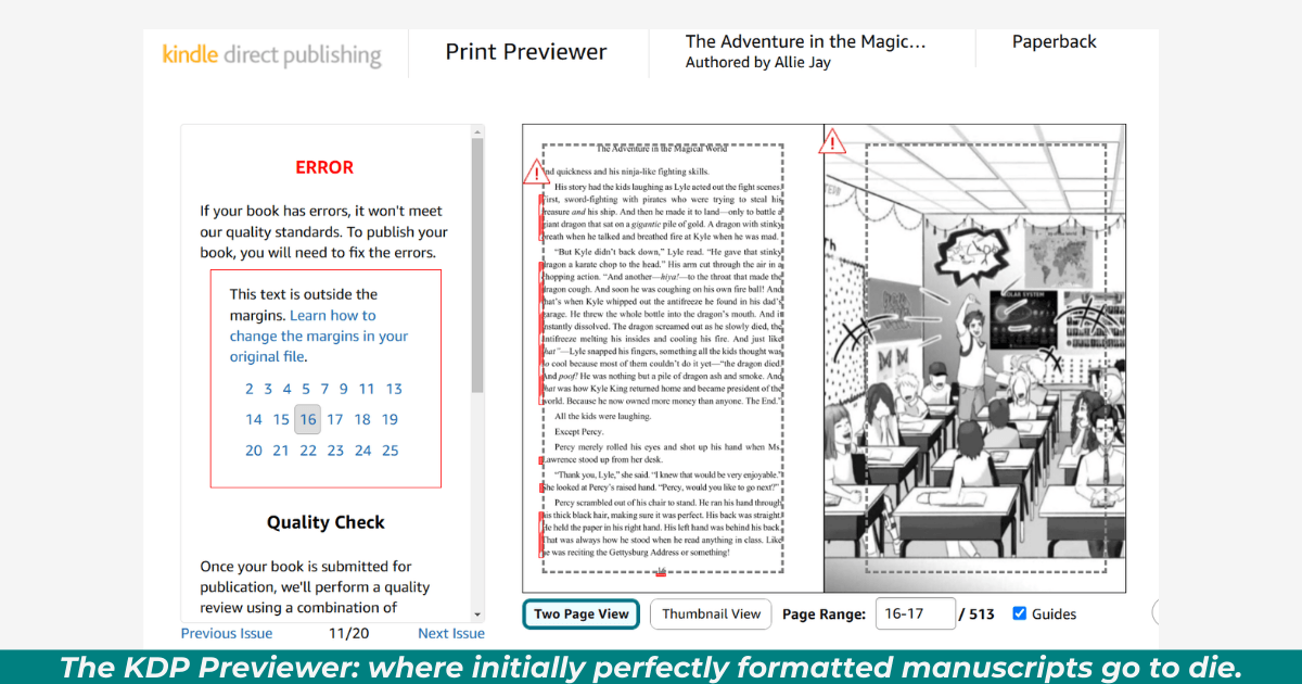
What I learned:
The automated previewer sometimes flags issues that don’t actually exist
Different support representatives give contradictory advice
The preview doesn’t always match the final printed product
Solution that worked: After multiple failed attempts, I discovered that sometimes simply resubmitting the exact same file without any changes would eventually pass the preview process. It’s as if the system needs multiple looks at the same file before it decides to accept it.
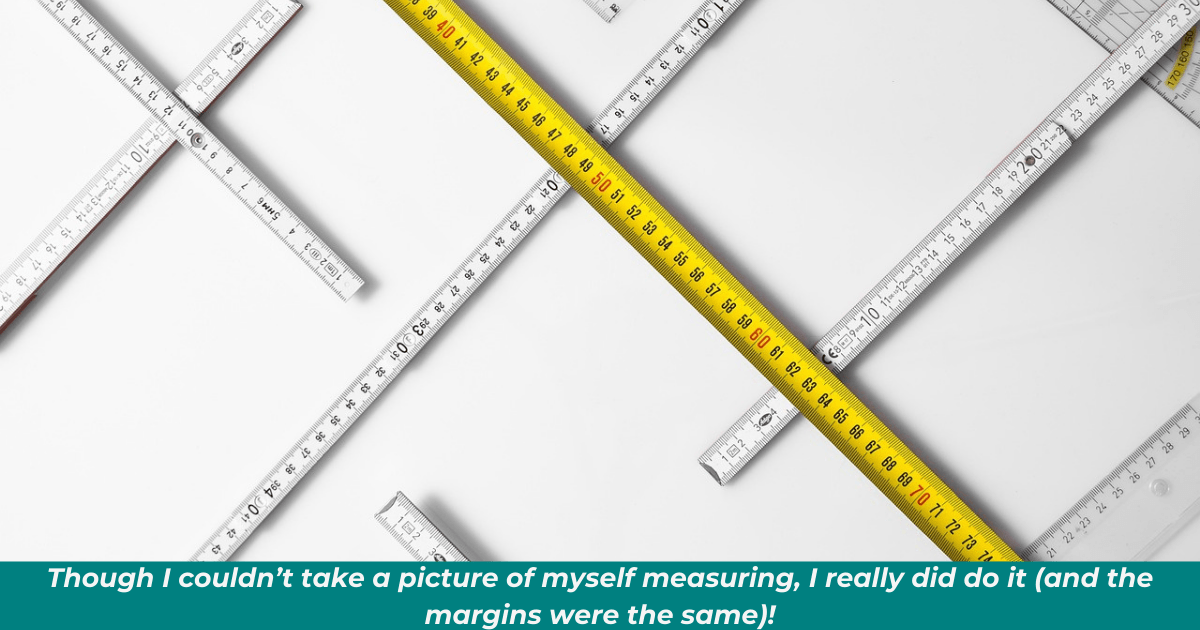
Margin Madness
Margins were a particular pain point, with the previewer insisting they were incorrect despite being set exactly to KDP’s specifications.
What I learned:
KDP’s stated margin requirements don’t always align with what their system actually accepts
Page numbers can trigger margin errors even when they’re within the stated boundaries
Bleed settings affect margin requirements in ways not clearly explained in KDP documentation
Solution that worked: Adding an extra 0.05” to all margin specifications beyond KDP’s stated requirements provided the buffer needed to pass the automated checks.
Image Intricacies
My book contained 23 illustrations, which introduced another layer of complexity.
What I learned:
Images need higher resolution for print than for digital (300 dpi minimum)
Images with “bleed” (extending to the edge of the page) need specific positioning
Image placement near page breaks can trigger mysterious formatting errors
Solution that worked: Creating a 0.25” safety margin inside KDP’s stated requirements for all illustrations ensured they wouldn’t trigger formatting errors.
But be advised: When you fiddle with the margins, you can add extra pages to your book, which may increase the cost (and could affect your royalty rates).
Hardcover Headaches: The Premium Format Pitfalls
The hardcover format should have been straightforward after navigating the paperback challenges. After all, I was using the identical interior file that had already been approved.
The KDP system had other ideas.
Margin Mysteries: The Sequel
What I learned:
Hardcover and paperback formats are processed by different systems with different standards
KDP’s hardcover format may be newer with more quirks than the established paperback system
Getting a proof copy doesn’t mean your file has passed all the automated checks
Solution that worked: Frustratingly, increasing all margins by another 0.05” (beyond the paperback’s already increased margins) finally satisfied the system, even though the original margins were within specifications.
Again, remember that increasing margins may affect the book’s total pages and royalty rates.
Cover Complexities
The hardcover format requires a different cover approach due to the case wrap and dust jacket options.
What I learned:
Cover templates vary significantly between paperback and hardcover
The spine width calculation is different for hardcovers
Color reproduction can vary between formats
Solution that worked: Creating a separate cover file specifically for the hardcover format with slightly adjusted colors to account for the different printing process.
Pricing Paradox
Pricing the hardcover introduced another learning curve.
What I learned:
Production costs for hardcovers are significantly higher
Minimum pricing is based on page count and trim size
The hardcover market has different pricing expectations
Solution that worked: Setting the hardcover price at $19.99 provided a balance between market expectations for a premium format while still allowing a modest royalty.
Universal KDP Truths
Beyond the format-specific challenges, I discovered several universal truths about KDP that would’ve saved me considerable stress had I known them from the start.
The 72-Hour Illusion
KDP’s favorite promise — “please allow 72 hours” — is more of a minimum than a maximum.
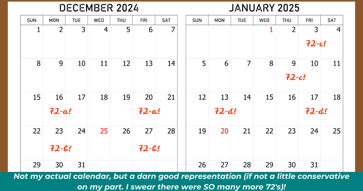
What I learned:
Each format has its own 72-hour clock
Technical issues reset the clock
“72 hours” often stretches to 5-7 business days
Solution that worked: Building extensive buffer time into my publishing schedule for future books.
Documentation Disconnects
KDP’s official documentation doesn’t always align with what their system actually requires.
What I learned:
Following KDP’s specifications exactly doesn’t guarantee acceptance
Support representatives often quote the same documentation that isn’t working
The system’s requirements seem to change periodically without documentation updates
Solution that worked: Building relationships with other KDP authors to share current, real-world experiences rather than relying solely on official documentation.
The Review Team Myth
KDP’s Review Team is mentioned by support staff as a solution, but accessing them is nearly impossible.
What I learned:
You cannot appeal to the Review Team if your manuscript has “issues”
The Review Team only reviews manuscripts with no issues (making them essentially useless for troubleshooting)
Getting escalated to the Review Team is largely a matter of luck and persistence
Solution that worked: Being extremely persistent with support, requesting supervisor reviews, and occasionally resubmitting unchanged files to see if they pass on another attempt.
A Silver Lining: What KDP Gets Right
Despite the frustrations, KDP does offer significant advantages that soothe the headaches:
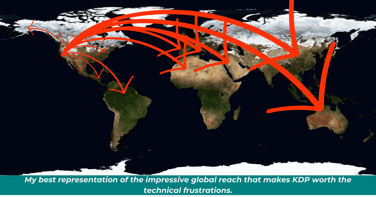
1. Global Distribution — My book is available worldwide with minimal effort
2. No Upfront Costs — Unlike some modern self-publishing companies, there are no fees to get started
3. Print-on-Demand — No inventory management or upfront printing costs
4. Competitive Royalties — eBook royalties in particular can be very favorable
5. Complete Creative Control — No compromises with publishers about content or design
6. Total Ownership — No one else owns the rights to your story
Would I Do It Again?
Absolutely — but with adjusted expectations and a much better understanding of the technical hurdles each format presents.
The learning curve is steep, but it’s also climbed just once. My next book will benefit from all the hard-won knowledge I’ve gained through this process. I’ll know what to expect, how to prepare, and most importantly, how to avoid the most common pitfalls.
For all of its flaws, KDP has democratized publishing in a way that was unimaginable just a decade ago. The power to create, publish, and distribute a professional-quality book worldwide is now in the hands of authors, not the gatekeepers.
That power is worth fighting for, even when the fight involves mysterious error messages, invisible covers, and the occasional urge to throw your computer out the window (also known as defenestration, a practice I grew increasingly fonder of the more my struggle endured!).
Stay tuned for next week’s final post in this trilogy: “Navigating KDP’s Approval Process: Tips for New Authors,” where I’ll provide a step-by-step guide to smoother sailing through the KDP publishing journey.
Are you struggling with a specific KDP technical challenge? Have you found workarounds that might help other authors? Share your experiences in the comments below.
Related Topics: kdp technical issues, ebook formatting guide, paperback publishing tips, hardcover publishing challenges, kdp previewer solutions, book margin requirements, publishing timeline expectations, kdp cover problems, self-publishing formats, children’s book illustration formatting
* NOTE: I mentioned book 1 in my Swallowtail Four series. If you’d like to get your copy of The Adventure in the Magical World, click the link.
Post and SEO images courtesy of Meta’s AI. Two images from Pixabay’s Bruno (rulers) and WikiImages (world map).

Alicia Strickland
Hi! I write across multiple genres under various pen names. But for nonfiction, I write as myself.
As a designer with a love of Old Hollywood and all things creative, I bring diverse perspectives to my storytelling... and to my blog.
In the unlikely event that I’m not writing, I enjoy crafting, gardening, or spending time with my flame-point Siamese, Hunter.
Want to stay updated? Sign up for my newsletter (below 👇) to receive exclusive content and be the first to hear about new releases!
YOU MIGHT LIKE

Jan 08, 2025
Jan 08, 2025
POPULAR POSTS
By Alicia Strickland on February 14, 2025

By Alicia Strickland
Jan. 05, 2025
REVIEWS

Jan 15, 2025
Dec 29, 2024
Jan 20, 2025
Feb 14, 2025

Crafting passionate tales for adult hearts and creating magical worlds for young minds!
Stay in touch!
Click “subscribe” to get weekly newsletter updates on all BBA news and books.
©️ 2026 booksbyalicia.com